Hello, my faithful readers!!
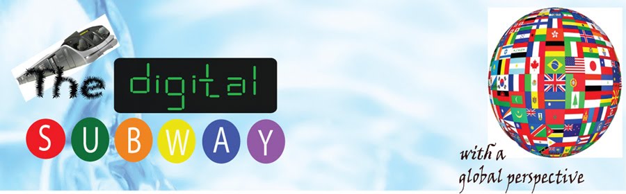
Do not be surprised by the change in Blogger Title page and the template. I thought it was time to give it a new look. This seemingly simple looking title bar isn't that simple. I created each and every part separately. If you look closely at the word "digital", you'll realize that it is not perfectly symmetric because I had this idea of creating the word by joining individual green lines. Painstakingly, I put it all together to spell the word correctly.

This logo is copyrighted by Digital Subway. I mean it!!! :D
And, look at the word, "SUBWAY", you'll realize that it is not perfectly even spaced either. Due to limitations on human eyes, such a discrepancy may not be obvious though. I had this idea from riding subways in New York last summer. This was not hard to create though, a simple circle with different colors and letters, piece of cake. Making all of this new logo took me more time than I thought it would. My photoshop skills had become rusty. Actually I prefer using Adobe Illustrator while making logos because they are more flexible and appropriate.
Anyway, I will update you about my life here in Auckland in next post. There is one funny story to tell. Keep posted.
No comments:
Post a Comment